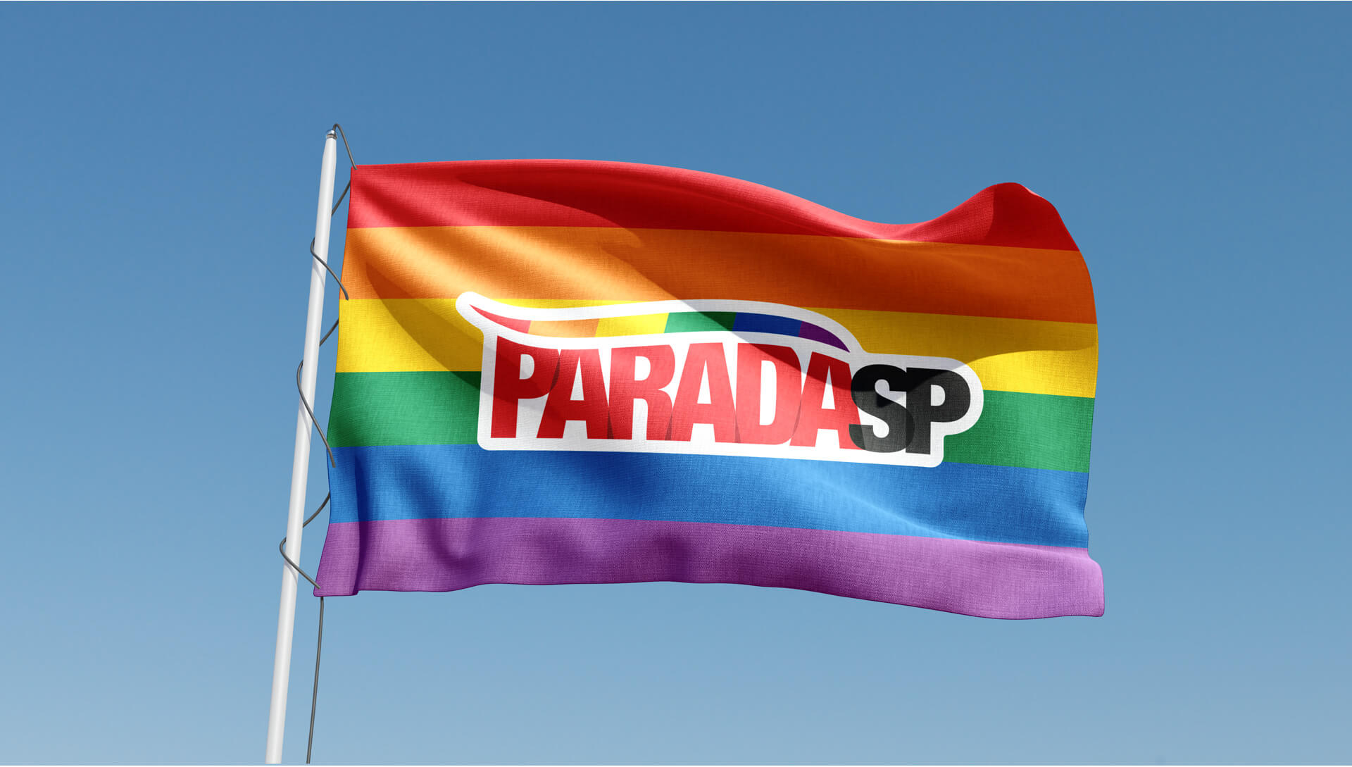
Identified as a pain point by the São Paulo LGBT+ Pride Parade Association, our client since 2022, the need to update the image and transform the association into something greater had to happen in 2024. A year of elections, a renewed board in the association, emblematic and important, nothing more fitting than moving forward as a revamped, global brand capable of being recognized by anyone from anywhere in the world.
Thus came the creative paths we found. Globalized symbols, broad ideas about what a Pride Parade is and how it should be represented.
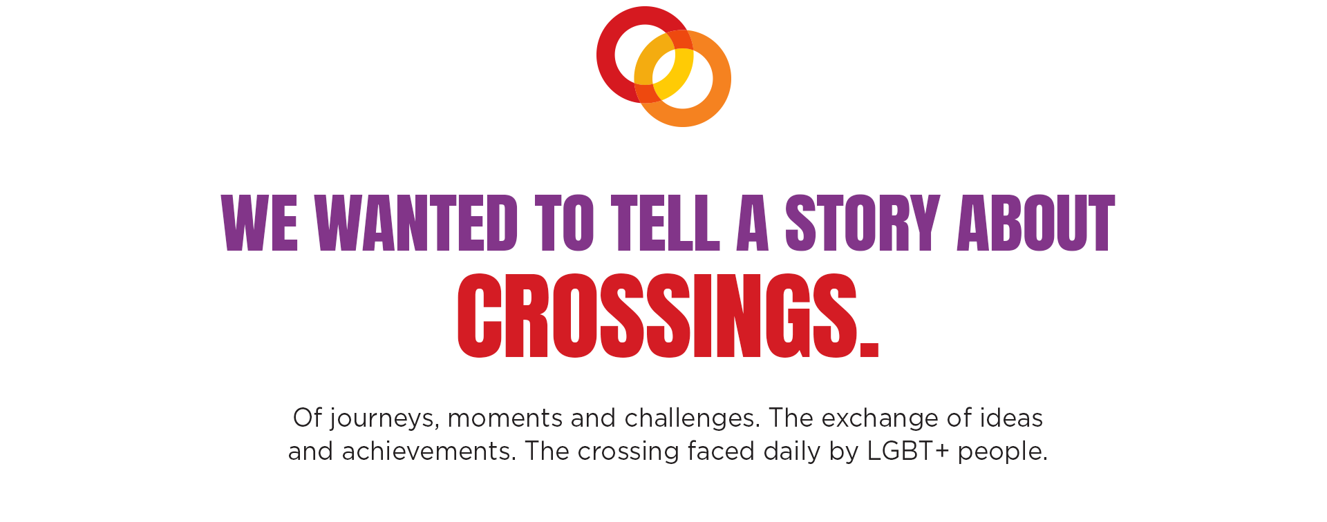
Just like those who walk down an avenue, the Parade, as a brand, intersects various issues, classes, and possibilities. Intersections, born from these constant encounters.
Thinking about the street and bringing the street into the brand is to engage with inclusion, social movements, and their intersections.
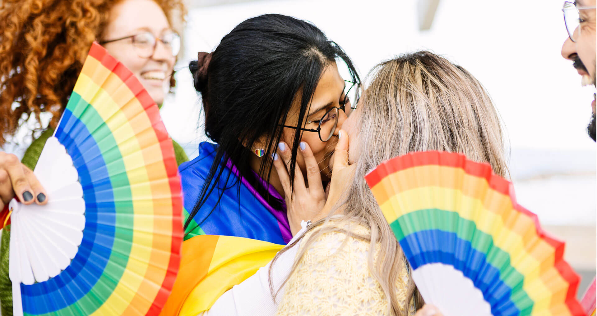
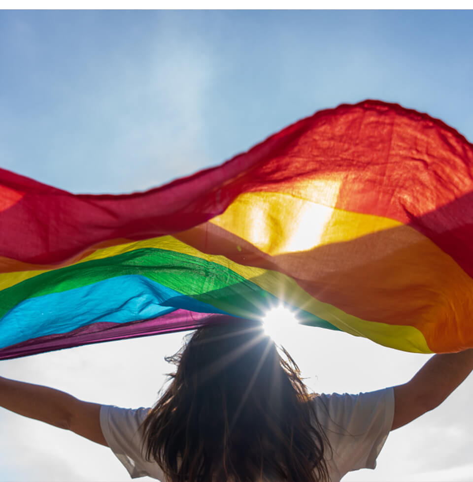
Diversity reclaims the spaces that are rightfully theirs.
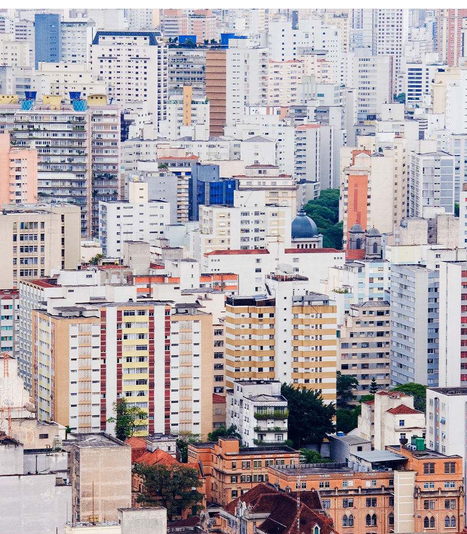
Avenida Paulista is the beach for those who live in the metropolis. It is imposing and tough, but extremely important and accessible so that everyone can occupy, frequent, and appropriate the city. At the same time, it is also necessary for the Parade to take the bus and reach the outskirts.
We have peripheral diversities that are often overlooked when it comes to the Pride Parade, and they need to be present within the new brand, feeling part of the whole that is the LGBT+ community.
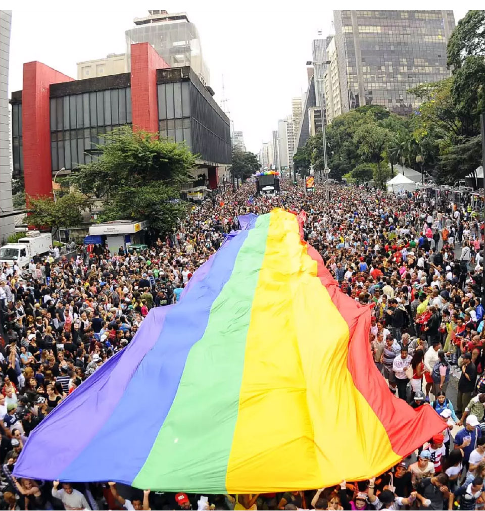
Like the intersections of an almost 3 km-long avenue, the Parade navigates through different issues and, like a giant flag, covers diverse people and their respective intersectionalities. Not as something to disturb or silence, but rather to welcome and engage with an entire community.
Just as it is important to walk and occupy with ownership an avenue that is a symbol of the city (and the country), it is important for the brand to appropriate symbols to subvert their meanings, creating a connection between the traditional and the contemporary.
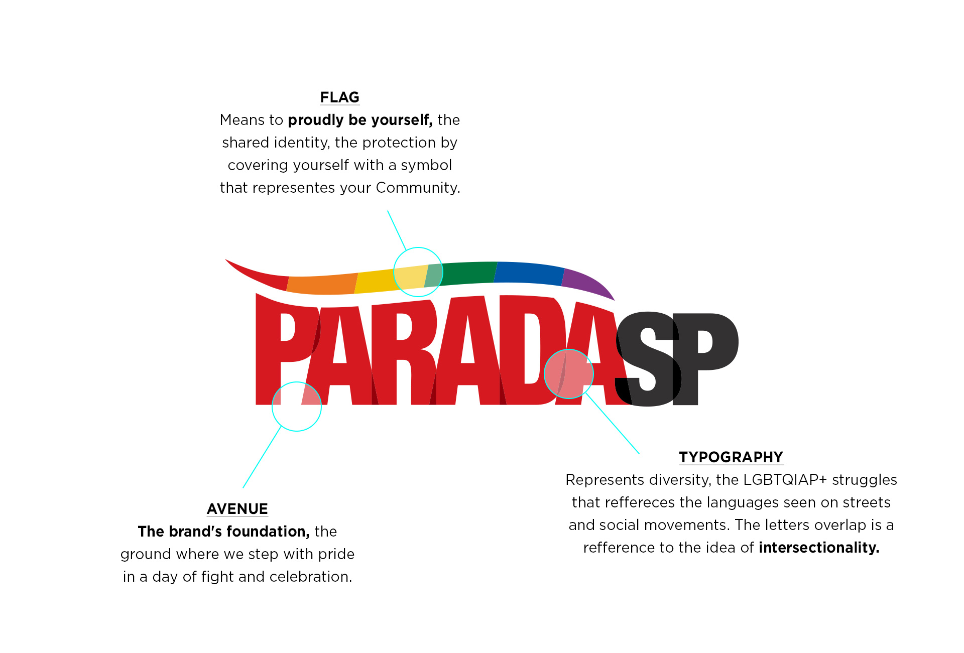
The new brand incorporates this strength, this conciseness, this ease of understanding. Even in its black-and-white application, it conveys the unity of the community, which is why I consider this rebranding of the Parade to be very successful.
It completely met expectations, with the brand being recognized by the public and the press!
André Fischer
Press and Communication Board PARADASP